-
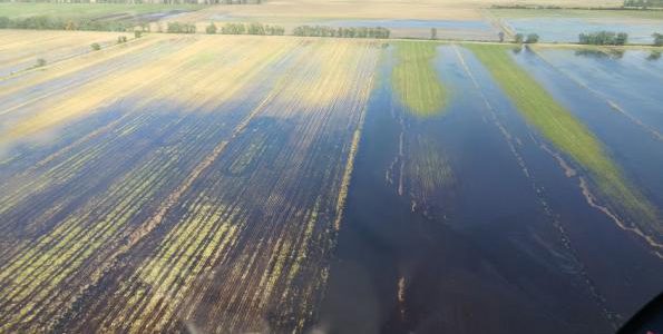
Now that most of the harvest for this year is finished, losses from Hurricane Matthew can be more accurately determined. AgWeb published a story today on how farmers in Marion County, South Carolina, were affected by the storm wind and flooding. You can read it here.
-

In addition to the update on La Niña, NOAA also released their monthly and seasonal summary this week. It shows that for the contiguous lower 48 states, this was the warmest fall on record, coming in 6.3 degrees above the 20th century average. November was the second warmest on record, coming after 1999. NOAA also…
Posted in: Climate summaries -
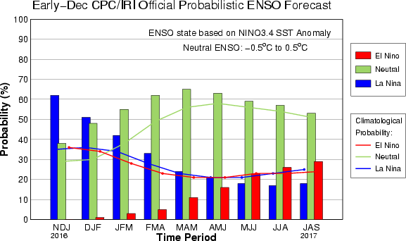
NOAA released their latest update on the current La Niña today. It indicates that La Niña is still occurring in the eastern Pacific Ocean but that it is likely to last for only a few months before going back into neutral conditions. The chance of an El Niño for next winter also seems to be…
-
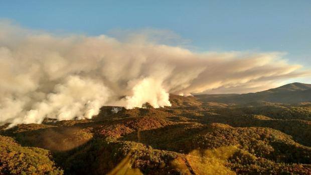
While most people think of wildfires as a Western phenomenon, events this year have pointed out that the Southeast is also an area that is ripe for wildfires. An recent article by Lyndsey Gilpin at https://fivethirtyeight.com/features/the-southeast-is-becoming-a-wildfire-hotspot/ describes the increases in wildfires in the Southeast over time. The article discusses whether wildfires are becoming more frequent and…
-
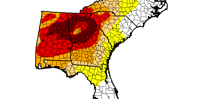
The welcome rain in the past week helped reduce the worst drought in the Southeast, although the overall area of dry conditions did not change. Just like the drought status is slow to worsen when we are going into a drought, the Drought Monitor authors remove drought slowly until it is clear that we have…
Posted in: Drought -

The National Weather Service noted that new experimental snowfall maps will be available this year for a number of stations across the US, including several in the Southeast. The new maps will show ranges of potential snowfall as well as probabilities of different amounts. That could provide some very useful additional information to what is…
-

The web site Adventures in Mapping shows a new drought map for the Southeast which captures the complexity of the current (fortunately waning) drought in our region using colored dots to represent drought intensity and frequency. You can read more about it and find a link to explain how they made the map at https://adventuresinmapping.com/2016/12/06/six-months-of-drought-in-the-american-southeast/.