Tools for climate and agriculture
-
A new role-playing game on preparing for drought is now available from the National Drought Mitigation Center. The game is designed to be played by at least 12 people, 6 on each side, plus a moderator, with a playing time of 90+ minutes. It is at the level of high school and up. I have…
-

If you have ever been asked for the climate projections for your county, here is a useful website which provides some of that information. The Climate Explorer at https://crt-climate-explorer.nemac.org/ allows you to look down to the county level to determine projections of future temperature, precipitation, and degree days for a couple of different climate scenarios.…
-
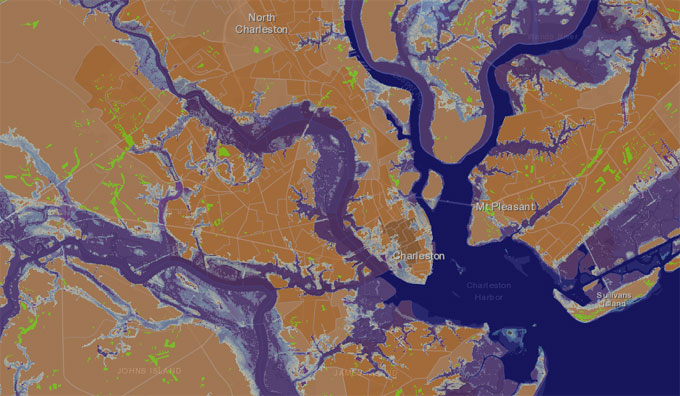
Yale Climate Connections released a short audio report this week on how Charleston SC residents are identifying areas of their city that are being affected by rising sea levels that even the best computer models missed. Listen to how they did it and find a link to an online tool from the Charleston aquarium which…
-

With the hot temperatures that are forecast to occur in the Southeast next week, I’ve been getting some questions about how you determine when the average date of first occurrence of 90 F is for a given location. Here is a way to do it using XMACIS2, an online data search tool from the Regional…
-

While the Southeast is not ever likely to be a big wind energy producer because of our relatively low wind speeds, there is still some potential for wind energy development in mountainous areas and along the coast. Here is a useful website that contains maps of potential wind energy for each state and for the…
-

The USA National Phenology Network is now releasing an improved suite Pheno Forecast maps for 12 insect pests (listed/linked below). Pheno Forecast maps show when a species is predicted to reach a life cycle stage that is managed/controlled. The forecasts are based on published growing degree day thresholds and are available up to 6 days in the future. You can now…
-
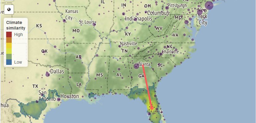
Here is a fun tool to try to visualize what the climate of your city (or whatever city you choose) is most likely to be like in 60 years. It allows you to pick what emissions scenario to choose (business as usual versus reduced emissions) and shows either the average result or the individual results…