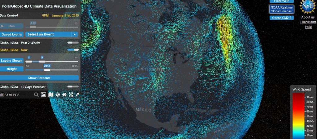
A new data visualization tool called PolarGlobe has been made available by scientists at Arizona State University. While it focuses on information from polar regions, it has global atmospheric circulation and also some ocean circulation information at multiple levels. I haven’t had the chance to play with it much yet, but it looks like it contains some interesting things to look at. Try it out at https://cici.lab.asu.edu/polarglobe/ and see what you think.