Interesting weather images
-
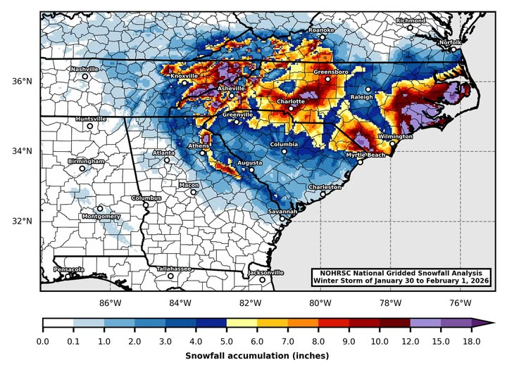
I have seen several snowfall maps of the snow that fell during the storm this past weekend put together by various television meteorologists and others. Here is one I like that was created using the NOHRSC National Gridded Snowfall Analysis by Jordan McLeod of the University of South Alabama that really captures the complexity of…
-

NOAA’s Climate Prediction Center issued their final outlooks for February 2026 late last week. They show that colder than normal temperatures are likely to occur for the month, not a surprise considering the current weather and the likelihood of another cold outbreak the second week of the month. Precipitation has a chance of drier than…
-

An experimental product by NOAA scientists was used to create a map of estimated freezing rain coverage that occurred in the storm that just occurred a few days ago. The map of ice shows the huge extent of freezing rain that occurred in the storm, including the freezing rain that occurred in the Southeast as…
-
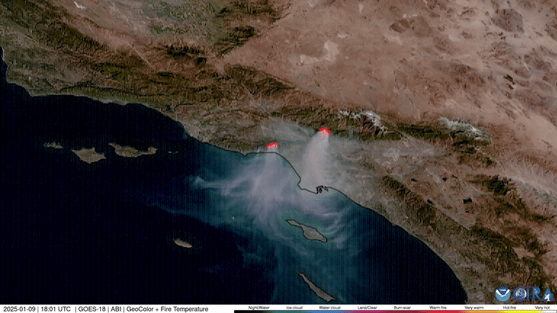
Earlier this week, NOAA released an album of interesting images seen from their satellites over the past year. It includes dust storms, hurricanes, atmospheric rivers, and the eruptions of Hawaii’s Kilauea volcano. You can view the photos and videos at https://www.nesdis.noaa.gov/news/2025-the-view-noaa-satellites.
-
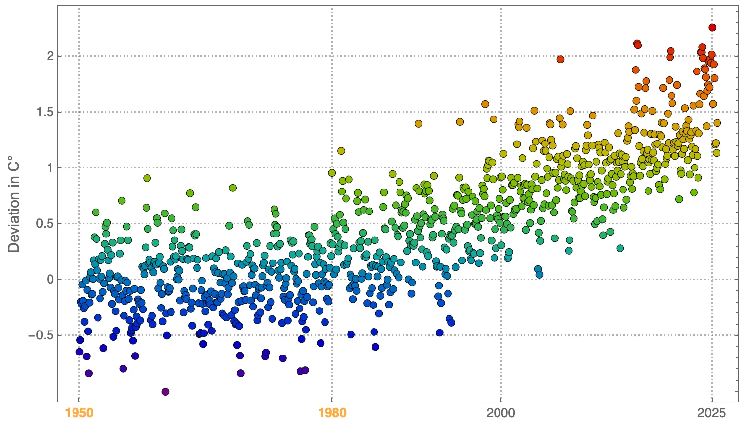
Here’s a different way to depict the increase of the earth over time. According to the creator, Harlan Brothers, his YouTube video presents “a visualization and sonification of global temperature anomalies over land. The deviations are based on the average temperature from 1950 to 1980. Each note (and point on the graph) represents one month.…
-

As we approach the one-year anniversary of Hurricane Helene crossing parts of the Southeast, NOAA has produced a new GIS storymap which describes the history of the storm and its impacts on Florida, Georgia, and the Carolinas. Many of the NOAA employees at the National Centers for Environmental Information, located in Asheville NC, were personally…
-

ProPublica published a series of maps describing how the climate of the US is likely to change by mid-century back in 2020. It popped up in my social media feeds this week so I thought it might be good to highlight it again. You can see the article at https://projects.propublica.org/climate-migration/. One of the most striking…