Tools for climate and agriculture
-
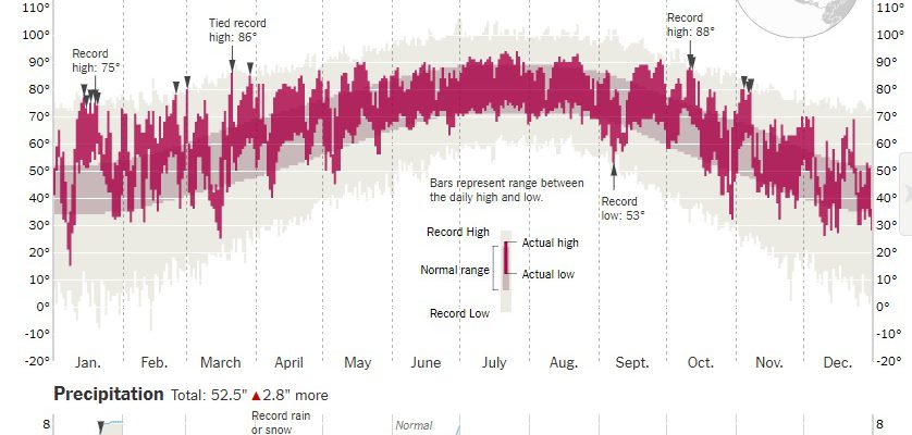
Here is a fun tool from the New York Times. You type in your city (there are 3800 possibilities) and see a daily record of high and low temperature and monthly accumulated precipitation, with annotations for records. I have it set to Atlanta but you can easily check your own city. Try it at https://www.nytimes.com/interactive/2018/01/21/world/year-in-weather.html#atl.
-
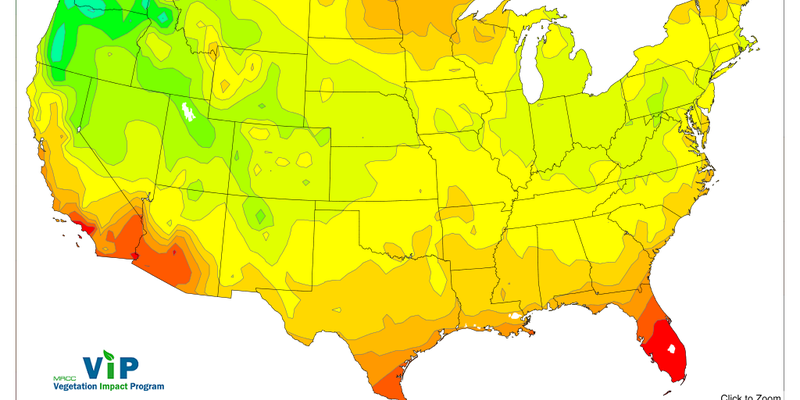
In my talks at the Southeast Fruit and Vegetable Growers meeting in Savannah last week, I discussed sources of chill hour accumulations for different states in the Southeast. If you are outside the Southeast or want a more national view, the Midwestern Regional Climate Center offers a national map through their Vegetation Impact Program (VIP)…
-
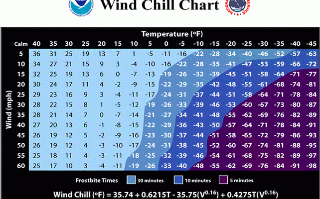
“Wind chill” is a measure of how much colder you would “feel” if cold air is blowing on you with a particular wind speed. The higher the wind speed and the lower the temperature, the colder the wind chill temperature. The colder the wind chill, the faster you could experience hypothermia and suffer severe health…
-

The USDA has announced the availability of a new GIS-based plant hardiness zone map, which is zoomable and is based on 1976-2005 data. You can read more about it at https://planthardiness.ars.usda.gov/PHZMWeb/AboutWhatsNew.aspx. You can access the map at the link above by clicking on Interactive Map on the top menu or go directly to it at https://planthardiness.ars.usda.gov/PHZMWeb/InteractiveMap.aspx.
-

Fruit Growers News reported on a recent UF/IFAS web-based tool which is designed to help strawberry growers in Florida and South Carolina manage for botrytis and anthracnose fruit rots. It uses data such as temperature and leaf wetness to advise producers when to spray fungicides to help prevent these devastating diseases. You can read more…
-

If you are interested in looking at long-term trends in climate across the US, this “Beyond the Data” article by Jake Crouch does a great job of explaining where to get trend data and how to interpret it. I use NCEI’s tooks like the “Climate at a Glance” tool all the time when I give…
-
If you’ve been following the drought posts on this blog, you know that moderate drought is expanding across the Southeast. But sometimes the map doesn’t capture the full picture of what is going on in the ground because no one is there to report it. The Drought Monitor authors would love to have more information…