Climate science
-

Time magazine had an interesting story on the history of the invention of the thermometer that you might enjoy. It includes information on how the Fahrenheit and Celsius scales were developed and how Galileo invented a precursor of the thermometer called the thermoscope. You can read it here.
-
A recent study published in the journal Nature shows that as temperatures rise around the globe, the amount of oxygen that is dissolved in the water is decreasing. The rate of decrease is much larger in freshwater lakes than in the ocean. This is concerning because as oxygen levels decrease, life in the streams and…
-
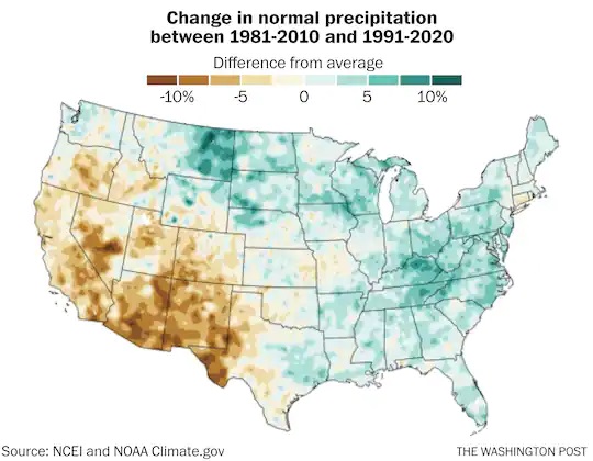
The introduction of the new normals has brought up a lot of questions on how the new values compare to those of previous periods. There have been a number of different comparison maps and tools that have been brought up. Farm Press posted a story today about another tool provided to compare the new normals…
-
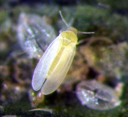
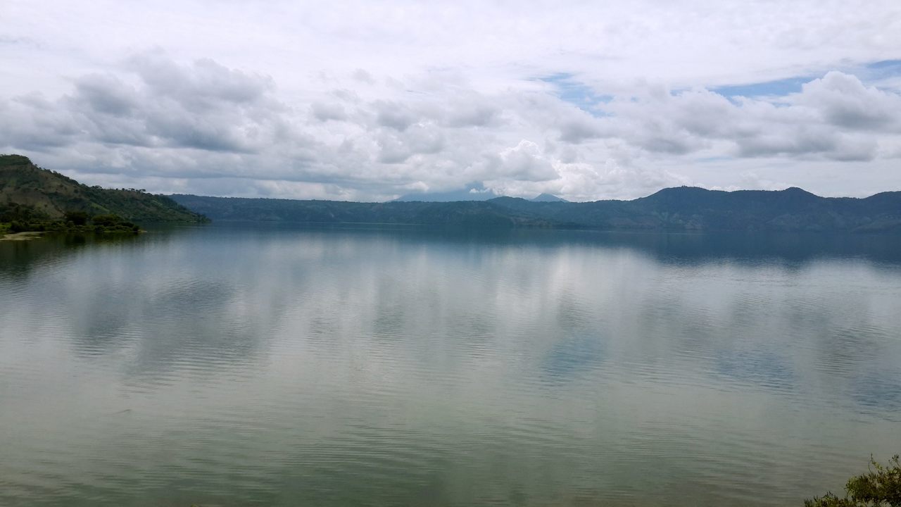
In the Southeast, we are observing changes to the water cycle as temperatures increase. We see both more intense rainfall events and more droughts. California is also seeing this and observing that the changes in climate are also leading to changes in pests and diseases, which the farmers there treat with pesticides and herbicides. But…
-
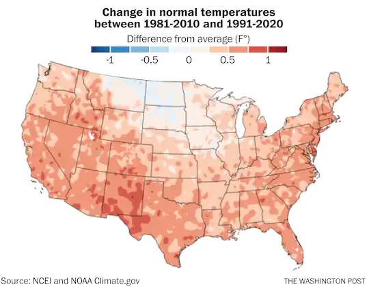
Today, NOAA released their new climate normals for the 1991-2020 period. These 30-year averages replaced the old normals that covered the period from 1981-2010. This is done every ten years to provide a consistent period of time for use in comparing monthly and annual climate information. There have been a number of news stories about…
-
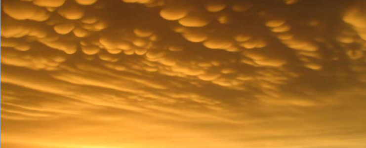
If you like to watch the clouds but don’t know what they are, you might enjoy this 9-minute video from the Cloud Appreciation Society’s founder, Gavin Pretor-Pinney. He starts with the lowest cloud types and moves up to the highest clouds. If you want to learn more, you can also visit the Cloud Appreciation Society…
-

Here’s a very cool video that shows how the shape of falling raindrops is not the teardrop shape that we drew as kids. Instead, it is closer to the shape of a hamburger bun. This video also shows how the size distribution of raindrops in a storm was originally measured using a pan of flour…