Climate science
-

Yale Climate Connections has an interesting story about the importance of the Great Smoky Mountains cloud cover on maintaining the local climate through balancing incoming and outgoing energy. Cloud forests at the tops of the ridges are maintained by dense clouds of microscopic water droplets and other areas benefit from the cloudy and moist conditions…
-
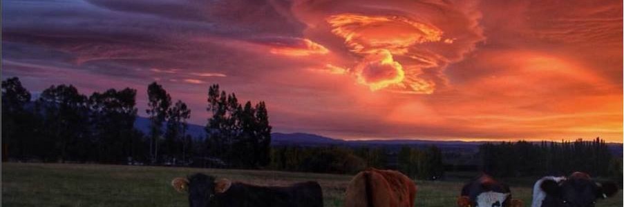
The Cloud Appreciation Society (https://cloudappreciationsociety.org/)is one of my favorite sites for viewing spectacular images of clouds. Here is a great story from Reuters about the society and how our views of clouds are changing our views of how the climate is changing. Clouds are one of the most important and not well understood influences on…
-

Plan G is a new initiative by television station 11 Alive in Atlanta to talk about how Georgians are reacting to changes in the climate that they see all around them. Here is a great 20-minute video showing people from around the state with various thoughts about climate change and how the state is working…
-

Today is the 200th anniversary of the birthday of Eunice Foote, one of the first scientists to study climate science and start to understand how carbon dioxide can affect earth’s atmosphere. My colleague Dr. Marshall Shepherd wrote a blog post about Foote in today’s Forbes.com. In the article he says: What exactly did Eunice Foote…
-
The Conversation had an interesting article this week looking at how yields of different crops are changing as the climate is getting warmer. Over the globe, yields are decreasing under warmer conditions, but it varies from place to place. Regions that are farther north are benefiting from the warmer conditions by increasing the length of…
-

A recent story making the rounds online tries to pair cities by taking one city (for example London) and looking at its projected 2050 temperature to find another city with a current climate that matches what London’s is expected to be according to climate projections. The city London was paired with was Barcelona in Spain.…
-
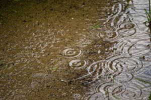
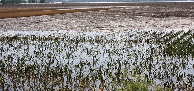
NOAA’s Climate blog posted a story earlier this week on the increase that has been seen in the US (and elsewhere) in heavy precipitation events. As warmer temperatures allow more moisture to evaporate into the air, it becomes “juicier” and more likely to produce heavy rain in downpours. This trend is likely to continue in…