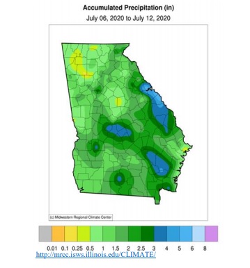
I received a comment today from one of our UGA Extension agents about the weekly rainfall map in the Georgia Crop Progress Weather and Condition Report. She said that she had received a note from one of the producers in her area complaining that the map did not catch the area of low precipitation near his house in Morgan County, Georgia. I spend a lot of time looking at rainfall maps, so I thought you might be interested in seeing how they differ. Since the map in the report has 7-day rainfall totals, I confined myself to maps that covered about the same time period, although there are other maps that cover either single-day precipitation totals or a month-to-date amount.
The map in the Georgia Crop Progress report is generated by the Midwestern Regional Climate Center. It is the first map below and is in soothing greens and blues. This map is produced using primarily National Weather Service cooperative observers’ data. Note the highest values are along the SC border near Augusta, where they received about 4-5 inches of rain in the last week. The driest area is up in the northwest part of Georgia near Rome, with less than 0.25 inches.
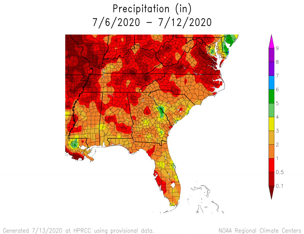
The second map is from the High Plains Regional Climate Center (https://hprcc.unl.edu/maps.php?map=ACISClimateMaps). It uses basically the same data as the MRCC map, but covers a broader area and uses a different color scheme. Overall the numbers are about the same, though, with the higher values of over 4 inches near Augusta and the lowest values near Rome at less than 0.5 inches. Different scales and different color schemes, but basically built on the same data. The data are smoothed between stations since there are only about 50-100 stations available across Georgia to include in the database. I am not sure if CoCoRaHS data from volunteer observers are included in either of these maps, but I will let you know what I find out here as an update later. The contouring of data between stations smooth out the data, making values farther from the stations less accurate. UPDATE as of 7-14-2020–The map produced for the USDA newsletter does include CoCoRaHS data, so if you don’t think it is capturing your area correctly, you might consider joining CoCoRaHS to provide better coverage.
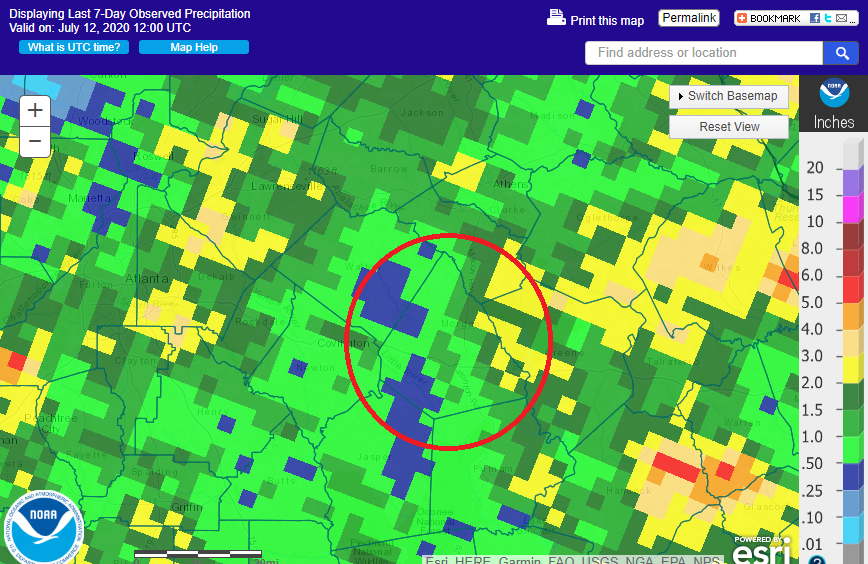
The third map is also a map of the weekly precipitation amounts across Georgia. This map is generated by the National Weather Service Advanced Hydrologic Prediction Service (https://water.weather.gov/precip/). This is an interactive map which allows you to zoom in on your area of interest. Unlike the other two maps, it is based on radar estimates of rainfall across the area. It shows the same general pattern of highest rain near Augusta and lowest near Rome, but with a lot more granularity. This is because the radar estimation process is able to break down rainfall into much smaller cells of information, which allow you to see individual storms everywhere, not just where the stations are. This makes it very useful for looking at small-scale variations in rainfall over space. The fourth map shows a zoomed version with a circle around Morgan County. And sure enough, the producer was right–there is an area indicated by radar in blue that had less than 0.5 inches, even though this does not show up on the first map.
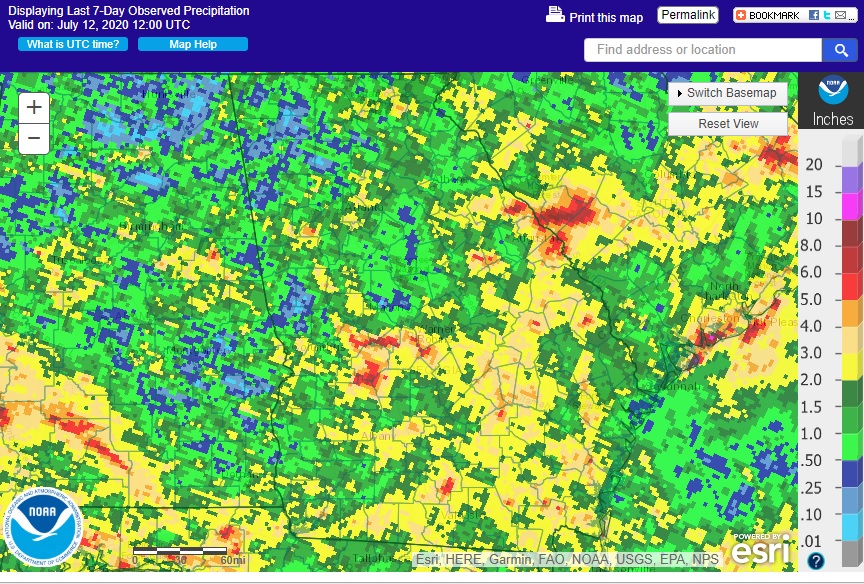
Why the difference? How maps look depend on how much data go into them. If you have a fairly small number of stations, then contours will be smoothed out and will miss sharp gradations in rainfall. If you have more stations, then you can get a more accurate picture of the spatial variability of precipitation (which is a lot more variable than temperature) and will be less likely to miss small-scale variations. If you have a lot of data like the radar estimates, more of that fine detail will be present in your map. Of course you might wonder why we don’t always use radar estimated rainfall to get the best picture. That is because radar estimates are not true ground-based estimates since the radar beam is up above the surface. Rain there can evaporate before it reaches the ground, so that would be an overestimate of ground-based rain. In heavy rain, sometimes rain is underestimated due to attenuation, which reduces the rainfall estimates. In hail, the dense hail stones make the rain look much heavier than it really is, overestimating the rain amount. And there are other issues that make radar estimates less useful, as well. (If you are wondering why it is pixelated, it is due to how the radar captures returns from raindrops and collects the information in bins that vary in size depending on how close you are to the radar site.)
The best solution: more ground-based precipitation observations! This is why I encourage people to take their own rainfall measurements, especially if they can feed that data into a national network like CoCoRaHS, which will allow the rainfall measurements to be captured in maps like this.