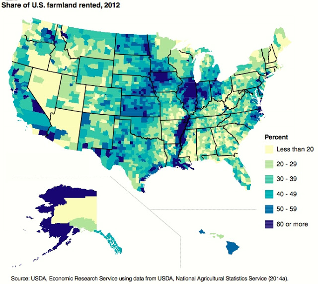
Big Picture Agriculture has a short but interesting article on a new publication showcasing a variety of maps that describe land uses across the US. Since I love maps, it was fun to look at the maps and think about what they mean for agriculture here. The map below shows the percent of land owned versus rented; I was surprised that most land in the Southeast is owned and not rented. That makes it economically more reasonable for farmers here to improve their land compared to rented land, since they will recoup their investment in future years. You can read the article at https://bigpictureagriculture.blogspot.com/2017/09/three-interesting-land-use-graphs-united-states.html. If you are interested, use the link on the bottom to click through to get more information on the full report.