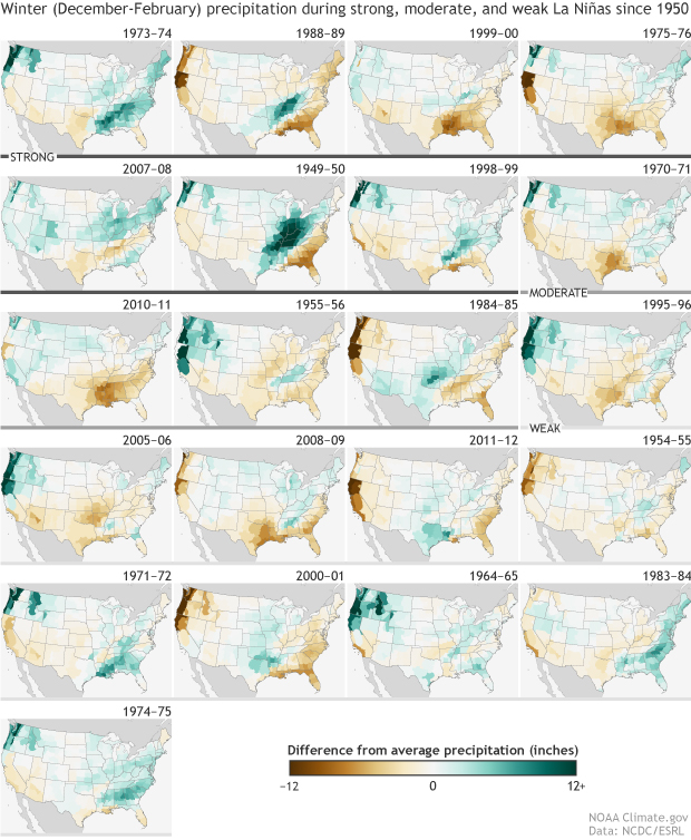
With a La Niña forecast to occur this winter, you might be wondering where the forecast for warmer and drier than normal conditions comes from. It is based on statistical patterns derived from previous episodes. NOAA’s Climate.gov has provided a nice set of maps which shows how historic La Niña events since 1950 have looked. The maps allow you to see the variations from one La Niña to another and to compare strong to weak episodes. You can read more about it at https://www.climate.gov/news-features/featured-images/precipitation-patterns-during-every-la-ni%C3%B1a-winter-1950. There are also links to temperature patterns and those for El Niño.