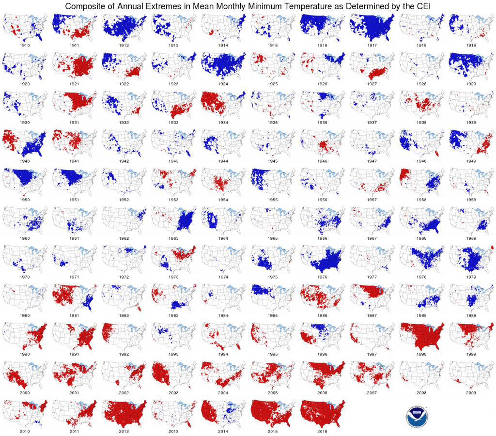
Deke Arndt of NOAA’s National Centers for Environmental Information provided the following interesting commentary about one of the graphs in the national climate summary that came out yesterday:
As far as temperatures go, and especially “extreme” temperatures go, minimum temperatures (a.k.a. “Tmin”, “morning lows”, “overnight lows”, etc.) are increasing more than maximum temperatures (a.k.a. “afternoon highs”). This last year was the 2nd warmest for the US overall, but the warmest for minimum temperatures.
I like this composite map, which shows which parts of the US have had extremely warm Tmins since 1910. The last two or three decades have really seen an expansive growth of warm Tmin extremes (in red – extremely cool Tmins are in blue).
If you have plants or livestock, you know what really warm summer nights mean. If you don’t have A/C, it’s rough. If you *do* have A/C, it’s expensive.
p.s., several other “extremes” maps near the bottom of https://www.ncdc.noaa.gov/sotc/national/201613