The content on this page is retained only for recordkeeping, historical reference, or research. These materials are preserved in their original form and may not meet current WCAG 2.1 AA accessibility standards.
These archived materials are not required to be remediated. However, we remain committed to equitable access. If you need an accessible version of any archived item to participate in our current programs and services, we will provide one when feasible upon request at caesweb@uga.edu.
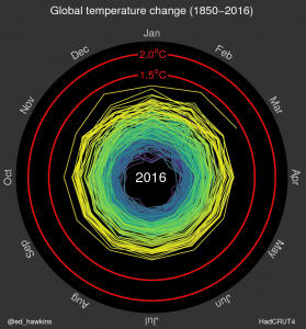
A lot of my friends have posted links to this spiral animation of global temperature anomalies over time. The Climate Lab Book shows how temperatures have changed from 1850 to the present using a spiral graph instead of a linear graph. You can really see how the temperatures have increased over time in this animation. Very cool to look at! Check it out at https://www.climate-lab-book.ac.uk/2016/spiralling-global-temperatures/.