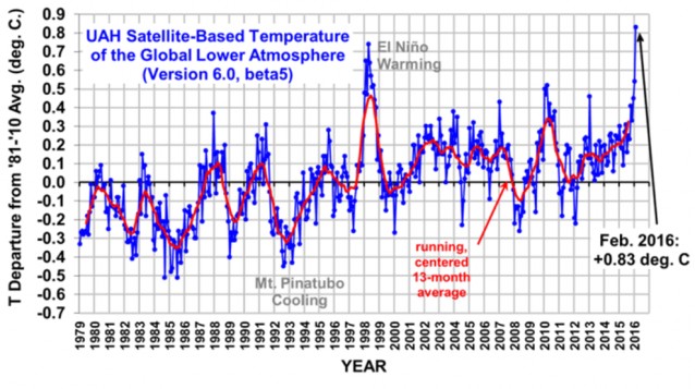
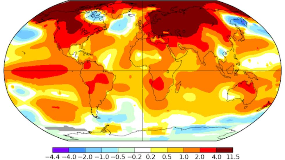
While NOAA has not yet released their global temperature data for February (that should be coming soon), other data sets of global temperature from NASA and the University of Alabama at Huntsville both show a large jump in temperature anomalies for February. In fact, the jump is so large that many climatologists were shocked at how big it was.
The large increase was due in part to the continuing presence of El Niño in the eastern Pacific Ocean, but the biggest warming was in the Arctic, where climatologists believe the signs of global warming are most visible. The two graphs of temperature from the NASA satellite compilation and the UAH compilation are shown below (note they have different starting years and vertical axes). The UAH time series is often used by those who are skeptical of warming to show that there is little increase in temperatures.
As you might expect, this has generated a lot of commentary in the news. Here are a couple of the articles, both with videos:
‘True shocker’: February spike in global temperatures stuns scientists from Sydney Morning Herald