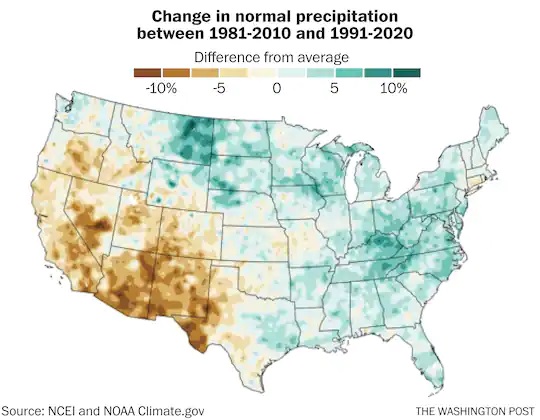
The introduction of the new normals has brought up a lot of questions on how the new values compare to those of previous periods. There have been a number of different comparison maps and tools that have been brought up. Farm Press posted a story today about another tool provided to compare the new normals to those of previous periods. It is offered by the High Plains Regional Climate Center and is available at hprcc.unl.edu. According to the story, “the tool allows users to dive into decades’ worth of data in a manageable way. Someone interested in how temperatures in Lincoln differ this May from the Mays of their childhood, for instance, can search weather station data collected at Lincoln Airport and set parameters that develop averages based on five years, a decade, 30 years or any number they prefer.”