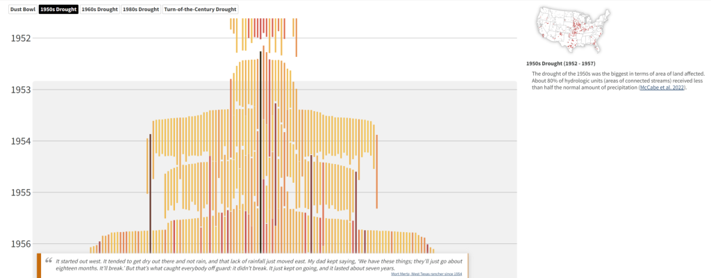
If you like to look at interesting visualizations of data, you may be interested in this new visualization of streamflow drought across the United States from USGS streamflow data. It uses bar graphs to show how long and how severe a drought got at particular streamflow gauges and how many gauges were affected by the low water conditions. The website shows that some droughts were much more widespread than others, especially the Dust Bowl and 1950s drought. You can view the graphic at drought-timeline (usgs.gov).
