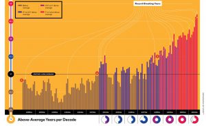
This week Popular Science posted an interesting new graphic on the global temperature. In addition to the yearly totals, it also highlights when the record high years occurred as the record got longer. It also highlights year by how much the temperature was above the long-term average. You can see a better view and read more here.
