You may have heard television meteorologists talk about the diurnal cycle in temperature in the past, and I thought I would spend a few minutes to discuss it and how the current drought is affecting the diurnal cycle in some parts of the Southeast. I am using an example from Rome GA, which is in the middle of extreme drought in northwest Georgia, but it would be generally applicable to any other dry area as well.
The first graph below is the hourly forecast from the National Weather Service for Rome for the next two days. On the graph days have a white background and nights a gray background. You can see on the graph that soon after daytime starts the temperature line in red starts to rise, and continues to rise until late in the afternoon. Then it starts to fall, and continues to fall overnight although it slows down after sunset. The lowest temperature is usually close to sunrise before the temperature starts climbing again. This cycle of temperature over the course of a day is called the diurnal cycle of temperature. On the graph you can also see the dew point temperature in green, but that temperature does not change over the course of the day nearly as much as the air temperature, since at least for the next two days we don’t expect any rain or other moisture to add to what is already present now.
When no fronts or storms are in the area, the diurnal cycle usually follows a curve similar to this one. If you have clouds, rain or a cold or warm front, the diurnal curve is not as nice and smooth as these ones. There can also be trends up or down over time. On the bottom set of the hourly graph you can see relative humidity also plotted in green, and it varies over the day because relative humidity is relative to the air temperature. As the air gets warmer, the RH decreases even though the moisture content of the air does not change. Usually RH is lowest when the temperature is highest.

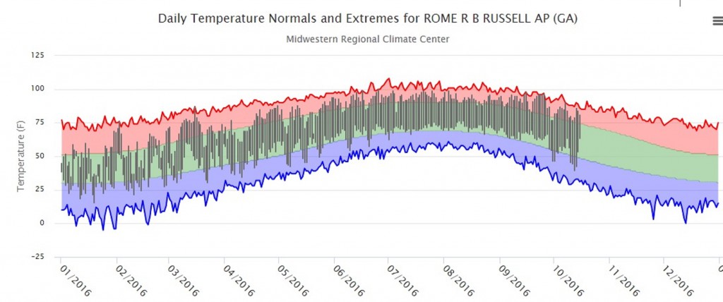
The second graph is a thermograph for Rome for 2016 to date. If you click on it you should get a bigger, clearer image. You can generate one for your own area from the Midwestern Regional Climate Center’s cli-MATE tool, which just requires setting up a free user id. You can see that the daily highs and lows plotted on the thermograph in gray bars show some interesting features. In the summer months, the daily high and low temperatures are higher than the long term averages (the green band) almost every day, which just indicates the consistency of hot temperatures this year. If any cold front came through, it was a very weak one!
If you look at the end of the record in recent weeks, I think you can also see that the range of daily highs and lows is larger than the normal range of temperatures. This is because the air and the ground are so dry that almost all the sun’s energy go into heating the air and soil and none to evaporating soil moisture or rain. That leads to a bigger diurnal swing in temperatures than in a wetter year.
If you look at trends in maximum and minimum temperature from NCEI’s Climate at a Glance tool over time, you will see that minimum temperatures are increasing a lot more quickly than maximum temperatures are. This indicates that the diurnal temperature range is decreasing over time. Climatologists are still trying to determine why this might be occurring, but the most common explanation is that moisture in the atmosphere is increasing. This change means warmer nights because the moisture keeps the air from cooling off. It can also mean more intense rains because there is more moisture to produce clouds and raindrops. In large cities nighttime warming may also be due to more pavement and buildings, since concrete can hold heat overnight more than sod or forests.