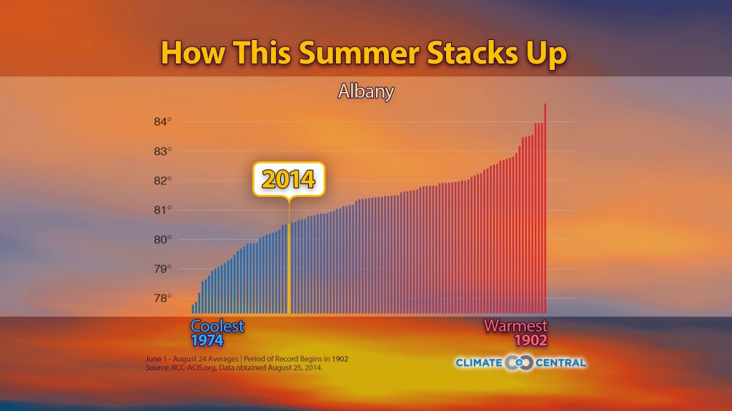
Climate Central has a new graphing tool which shows how this summer compares to temperatures in previous summers. There are just a few cities in the Southeast but it is fun and interesting to see how temperatures varied across the US. You can access the tool at https://www.climatecentral.org/news/us-summer-temperatures-comparison-17942. (Note that I had trouble visualizing the graph in Firefox but it worked in Internet Explorer.)