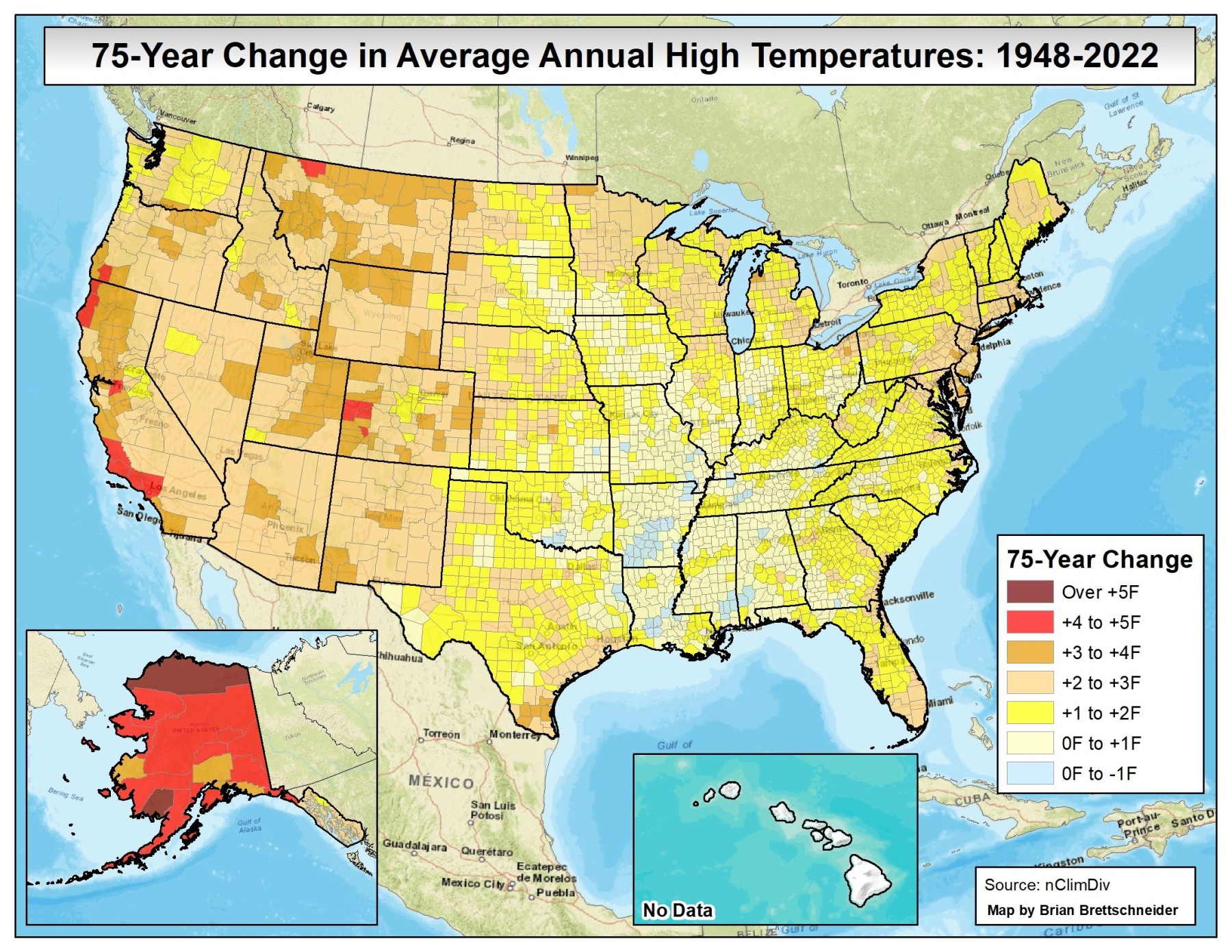
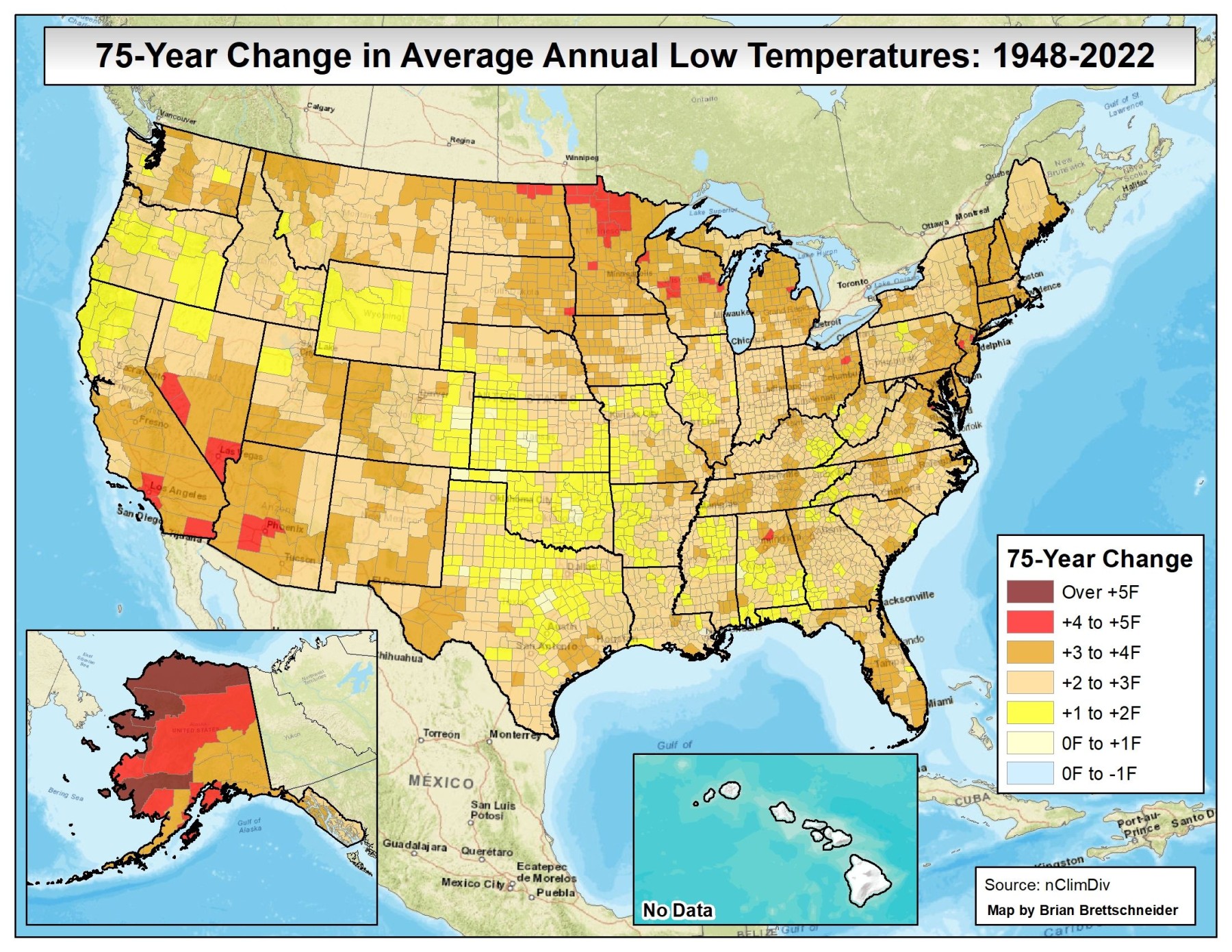
A climatologist I follow on Twitter, Brian Brettschneider (@Climatologist49) provides many great examples of climate maps (as well as moose pictures, since he is in Alaska) on his feed. Today he posted two maps showing the trends in maximum and minimum temperatures across the country from 1948 to the present. The two maps show that temperatures are increasing almost everywhere, but overnight low temperatures are rising more quickly than daytime highs. This may be due in part to increases in humidity that have also been observed at many stations and also to some increases in urbanization, since pavement absorbs heat during the day and releases it at night. However, the trend is clear even in the most rural counties, so while urbanization can increase this tendency, it does not explain all of it. I believe these maps were produced by NWS Rick Thoman.