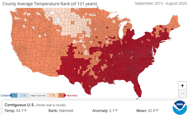
Deke Arndt of the National Centers for Environmental Information posted a map today which shows the 5-year average temperature ranking by county (September 2015 to August 2020) for the continental US. It shows that for large parts of the country including most of the Southeast, this has been the warmest 5-year temperature since records began in this dataset in 1895. If you think this is due just to urbanization, think about how many of these counties are rural, with no large cities, and in some cases, not that many small towns. You can explore this for yourself at https://www.ncdc.noaa.gov/cag/county/mapping/110/tavg/202008/60/rank.