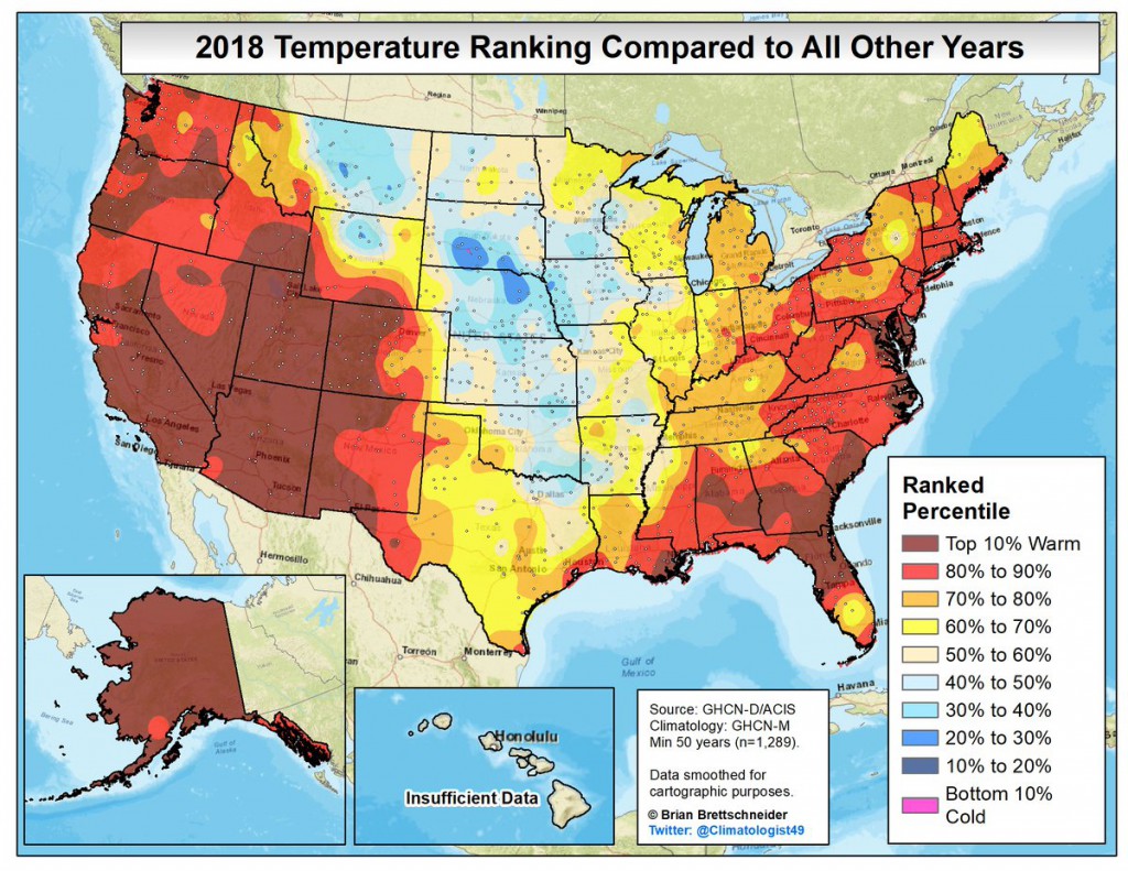
Here is an interesting map put together by Brian Brettschneider on how the annual average temperatures in 2018 compare to previous years. It is based on 1289 stations around the US that have temperature records going back at least 50 years. What is shows is that for large parts of the Southeast, 2018’s temperatures were in the top ten percent of warmest years (dark red on the map), particularly in central Alabama, southern Georgia, northern Florida and eastern South Carolina. Most other areas of the Southeast were in the top 20 percent of warmest years in those long records. Note the very large area in the western US that also meets this criteria, although the central US was quite cool this year compared to the long-term average. Interesting map!