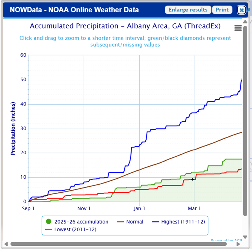
While I was working on slides for a talk tonight, I ran across this website from the National Weather Service that provides a way to generate temperature and accumulated precipitation graphs that I had not seen before. The accumulated precip graphs were very helpful for a presentation on the drought we are experiencing now in the Southeast. If you are interested in trying this out, you can go to https://www.weather.gov/wrh/climate?wfo=tae and choose either Temperature Graphs or Accumulation Graphs from the Products menu. You can pick out the station you want and the time period for display. If you are not in the Tallahassee NWS area (TAE) then change the web address to the 3-letter identifier for your area of interest (FFC for Atlanta, CAE for Columbia SC, JAX for Jacksonville FL, etc.) and you will get a list of stations that you can use in your graphs. Here is what the accumulation graph looks like: