Last week, I gave a talk at the Southeast Fruit & Vegetable Growers conference in Savannah to peach growers. One of the things we discussed was the change in chill hours over time due to the warming climate. I provided some graphs showing the decrease in chill hours that I created using hourly data from NWS sites such as airports. I promised to provide instructions for how growers can create their own graphs using data from the Midwestern Regional Climate Center. To be able to make the curves, you need to be comfortable with spreadsheets such as Excel, including the use of simple formulas and graphing techniques. I used the MRCC website because it will quickly do the counts of hours below 45 F for you and provide it in monthly totals, which makes it easier to create time series of growing degree days.
First, you need to obtain the counts of hours equal to or below 45 F (or if you want to get a little more sophisticated, between 32 and 45 F). This will not allow you to calculate chill portions, since that requires more programming skill. I use the Midwestern Regional Climate Center website at https://mrcc.purdue.edu/CLIMATE/ to get the data I need. To use their website, you have to sign up for a free account. Once you get in, use the Select Hourly Station at the top to pick the closest station to where you are. You can pick it by state or by map. Note that these are mostly airport stations, so there are not a lot in each state. You will want to pick a station that has a fairly long period of record to get the longest graph. However, I recommend not using data before about 1970 because of differences in instrumentation and siting at most airports that will result in odd values early in the record. Once you pick your station, then go to the left menu and pick Hourly-Observed Data and then Sub-Daily and then Threshold Search. Select Custom and choose your years of interest, then decide if you want to just count hours below 45 F (one threshold) or between 32 and 45 (two thresholds). Choose the criteria you want and click on Monthly Counts by Hour to get a total count of the number of hours below 45 F by month. Once you click on Get Climate Data, get a cup of coffee because it will take a few minutes to get the data.
Once the data are ready, it’s time to get Excel open. Select the years you want to use in your graph and copy them. I usually just use Control-C to copy and then use Control-V to paste the numbers into Excel. That will put in the monthly counts of hours below 45 F for each month of the year. You should see zeroes in the summer. To get the total of all the chill hours, you will need to add them up, starting in October of the year at the beginning of winter and ending in either February or March of the year at the end of winter. I usually just set up a new column with the values of the months added together into one total number of hours. Make sure you are using the October-December of the starting year and January-March of the next year to correctly get the total for that winter.
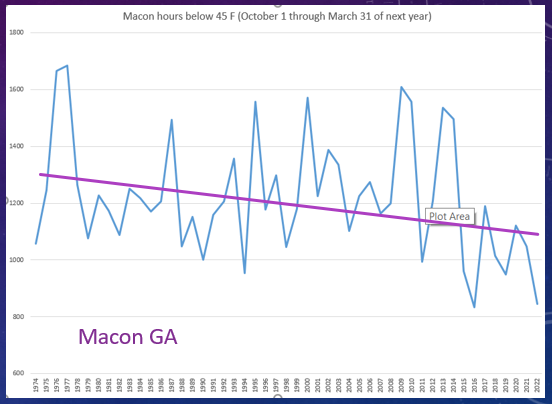
Once you get the sum of the chill hours for the winter, you can use Excel to insert a new Chart such as a 2-D line using the total number of chill hours as the Y variable. You might want to pick the starting year as the label for the X value to make it easy to see how they change by date. You can adjust the graph to your liking with titles if you are comfortable working with Excel. You should get a graph that looks something like the one below for Macon, GA. I added a trend line by hand using Insert Pictures to help highlight the decrease in chill hours over time. I hope this is helpful but please let me know if you get stuck.