The content on this page is retained only for recordkeeping, historical reference, or research. These materials are preserved in their original form and may not meet current WCAG 2.1 AA accessibility standards.
These archived materials are not required to be remediated. However, we remain committed to equitable access. If you need an accessible version of any archived item to participate in our current programs and services, we will provide one when feasible upon request at caesweb@uga.edu.
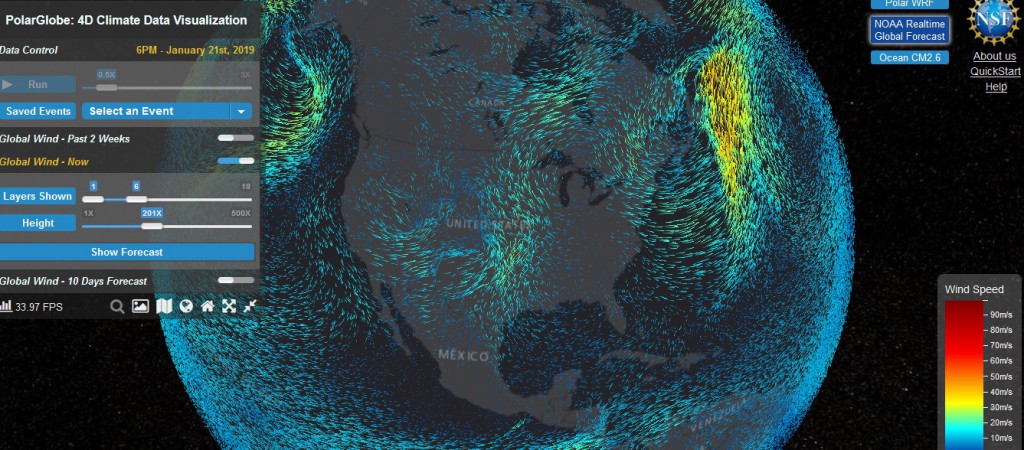
A new data visualization tool called PolarGlobe has been made available by scientists at Arizona State University. While it focuses on information from polar regions, it has global atmospheric circulation and also some ocean circulation information at multiple levels. I haven’t had the chance to play with it much yet, but it looks like it contains some interesting things to look at. Try it out at https://cici.lab.asu.edu/polarglobe/ and see what you think.